Iceland Symphony Orchestra 25/26
The project:
This year’s project for the Iceland Symphony Orchestra was twofold: to create new key visuals for the 2025-2026 season’s campaign, and to refresh the orchestra’s overall identity. The concept is based around the idea that discipline and a strong ground give the Symphony its freedom to be progressive and creative. That principle guided both the work for the brand’s identity, and for the campaign.
Project outcomes:
An updated visual identity
A refined logo
Key visuals for the 2025–2026 season
Our role:
Updated Identity
The Symphony’s design system needed to be flexible and dynamic – able to adapt to the orchestra’s wide range of projects to express.
We redrew the logo, drew a 3D rendering of it, introduced a new typeface, and brought it to life with a kinetic typography system within a disciplined layout.


Cookie consent required
To watch this video, you need to accept cookies for this service.
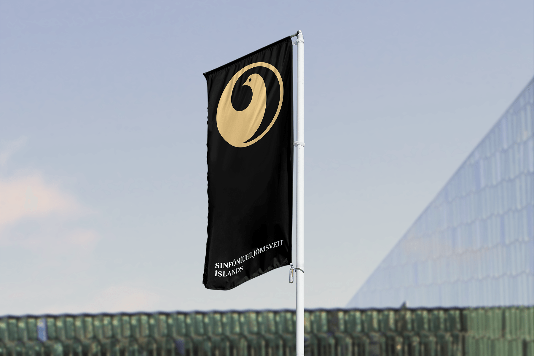
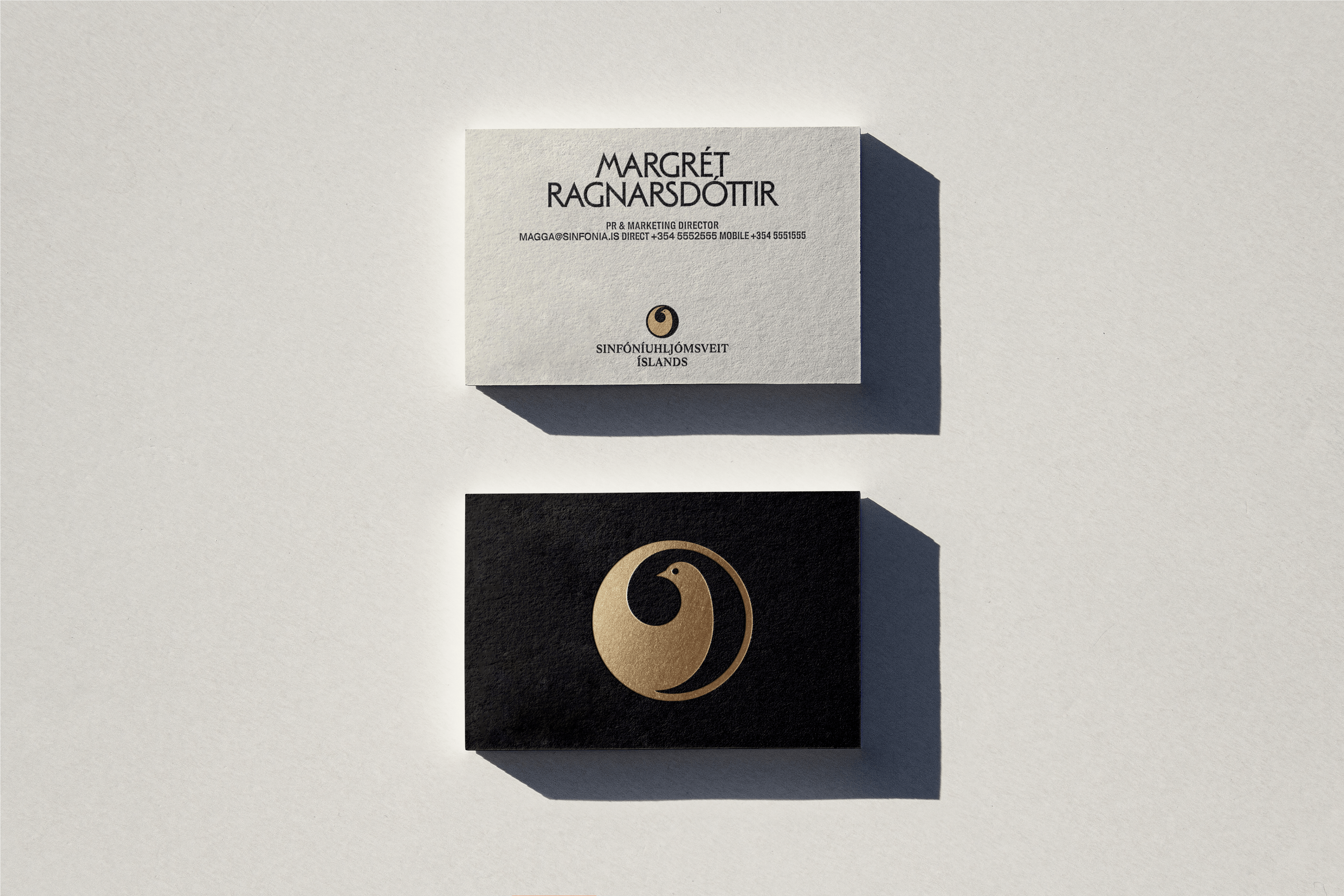
Logo
The Symphony’s original logo, designed in 1988 by Aðalbjörg Þórðardóttir, had gone through various minor updates over the years. It was time to rethink its technical execution to meet today’s technological standards and needs. The logo was redrawn based on the original design and adapted to modern scale and context requirements. To give it more distinctive presence and flexibility, the symbol can now also stand apart from the wordmark.
The logo gained new expressive power through 3D rendering, opening up possibilities in motion. Its original colors – brass and piano black – now carry greater depth and texture through the detailing and dimension that 3D brings.
Cookie consent required
To watch this video, you need to accept cookies for this service.
Cookie consent required
To watch this video, you need to accept cookies for this service.
Cookie consent required
To watch this video, you need to accept cookies for this service.
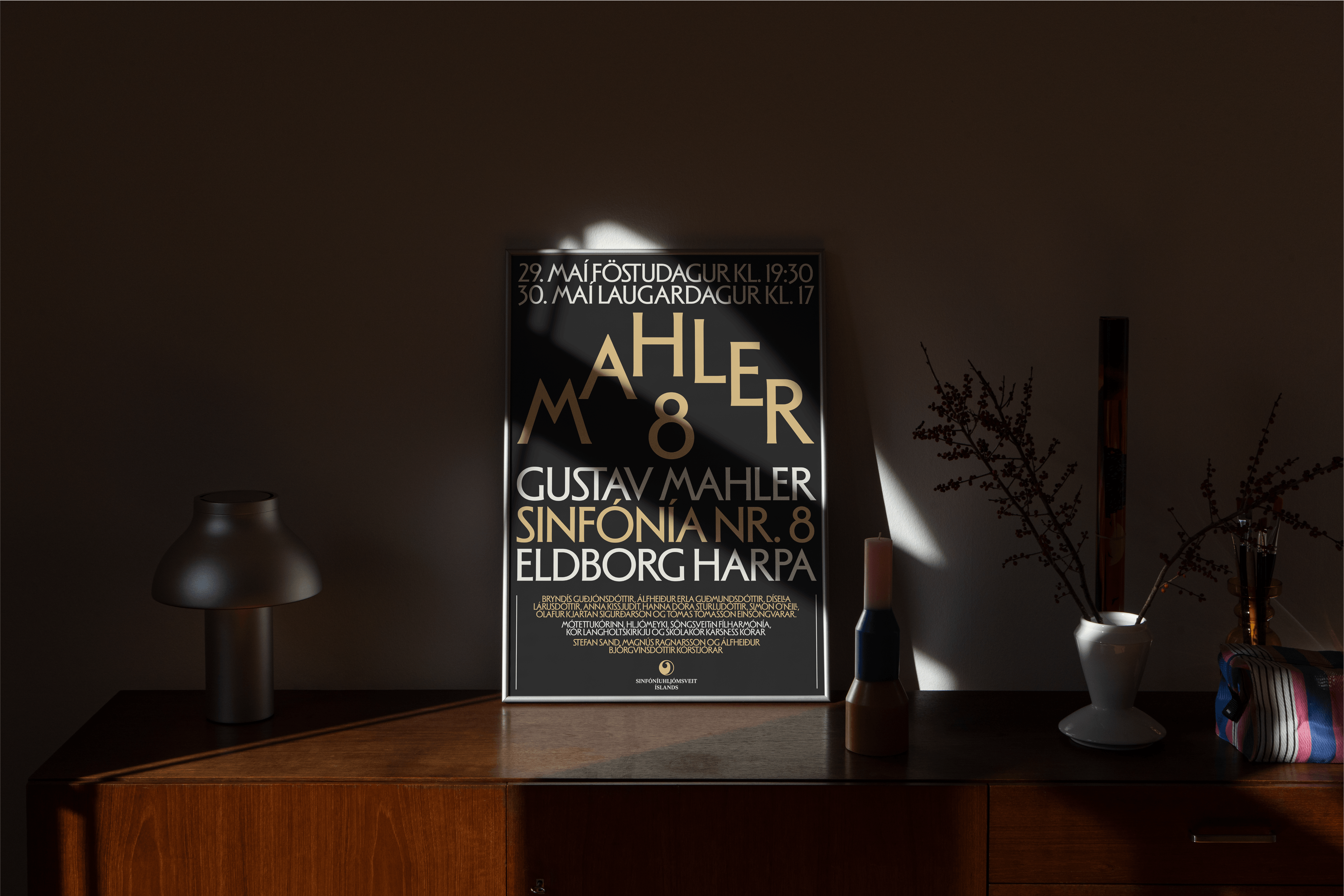
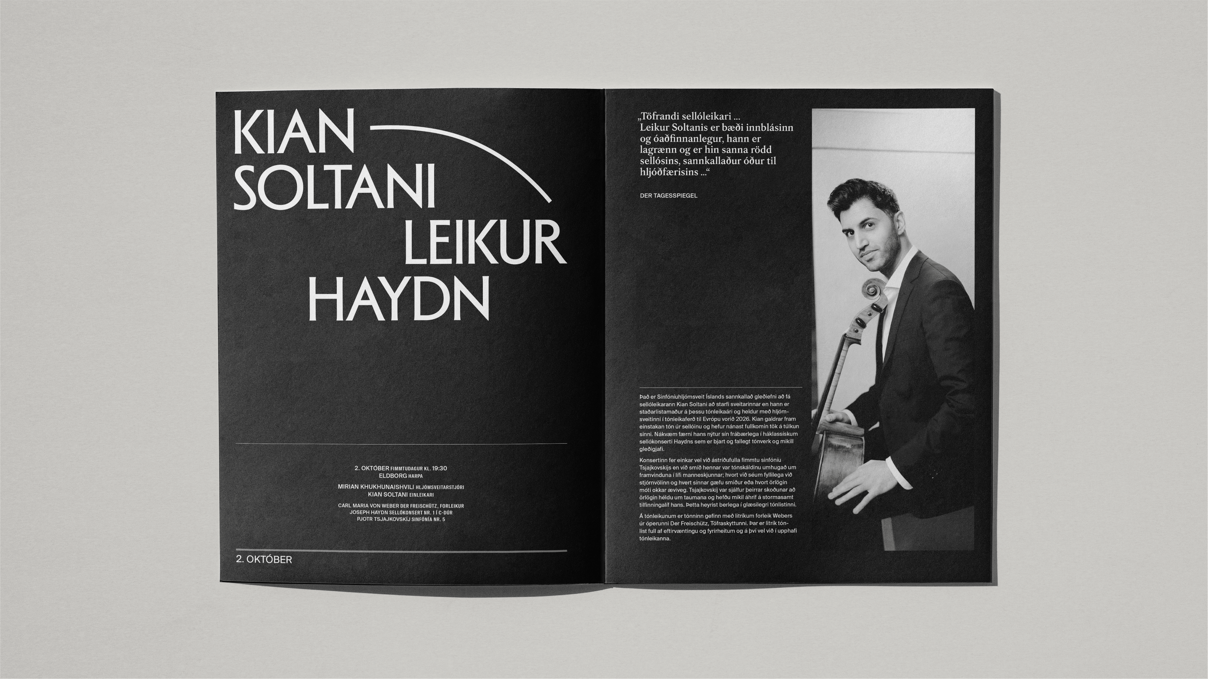
Layout
Typography can be a powerful expressive tool. We saw an opportunity to create a recognizable system flexible enough to reflect the character of the diverse works the Symphony performs.
The new typeface draws inspiration from 20th Century Nordic art and culture. It strikes the right balance between order and movement – refined yet playful. Its condensed width also helps solve challenges posed by long Icelandic words.
For the interaction of typography and imagery, we looked to sheet music. Layouts are divided into five horizontal lines, while vertical divisions follow rhythmic structures. Letters dance along these lines in both static and moving formats, bringing a new expressive dimension to the system. Musical notation symbols further unify the design language and help communicate the character of each concert.
Cookie consent required
To watch this video, you need to accept cookies for this service.
Cookie consent required
To watch this video, you need to accept cookies for this service.
Cookie consent required
To watch this video, you need to accept cookies for this service.

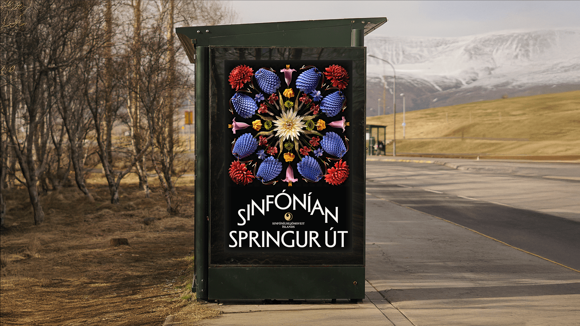
Campaign 25/26
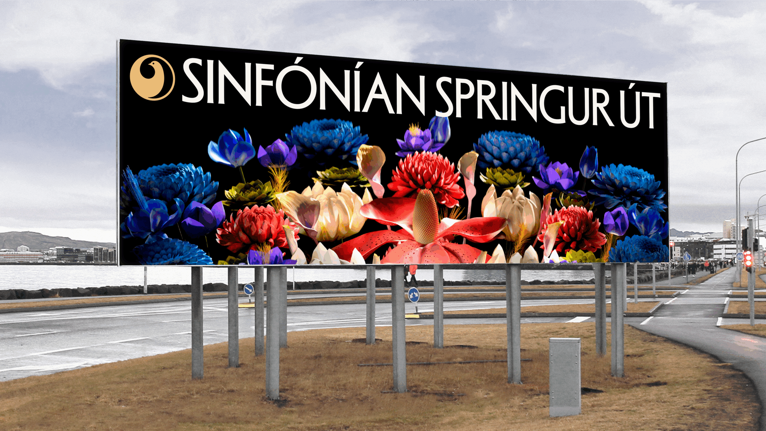
A national symphony orchestra is often seen as a hallmark of a thriving society. It’s the result of order and freedom in natural balance.
In recent years, the Iceland Symphony Orchestra has expressed this idea through the metaphor of flowers and growth. For 2025–2026, the concept was expanded and deepened, exploring a new world of rhythmic, symphonic blooms.
Cookie consent required
To watch this video, you need to accept cookies for this service.
Creative concept
Nature may seem random, but upon closer inspection complex patterns and rules are revealed. Materials in nature respond visually to sound: when sand is sprinkled on a steel plate and a violin bow is drawn along its edge, the grains arrange themselves into patterns shaped by the frequency. Once again, our concept emerged: order within chaos. We drew on this phenomenon to interpret the Symphony’s rhythmic floral universe.
Cookie consent required
To watch this video, you need to accept cookies for this service.
Cookie consent required
To watch this video, you need to accept cookies for this service.
Execution
For the fourth year in a row, we collaborated with Sigurður Ýmir to create the movements of the flowers in 3D. The blooms pulse to the rhythm of an excerpt from Stravinsky’s Le Sacre du Printemps, performed by the ISO, appearing to audiences from different angles, taking on the role of the orchestra itself. They mirror one another in symmetry, though never perfectly, leaving room for interpretation and freedom in each bloom. The tone of voice, like the Symphony’s music, remains captivating, rhythmic, and alive.
The outcome is a scalable and versatile design system that provides structure, allowing the Symphony room to bloom.
Cookie consent required
To watch this video, you need to accept cookies for this service.
Cookie consent required
To watch this video, you need to accept cookies for this service.